

Your Custom Text Here
This two-story house was severely damaged by fire. We remodeled the interior and exterior of house, improved the floorplan and upgraded the finishes.
The new design has more windows for natural light, another bedroom, more cabinetry and shelving, and an improved pantry and laundry room.
This two-story house was severely damaged by fire. We remodeled the interior and exterior of house, improved the floorplan and upgraded the finishes.
The new design has more windows for natural light, another bedroom, more cabinetry and shelving, and an improved pantry and laundry room.
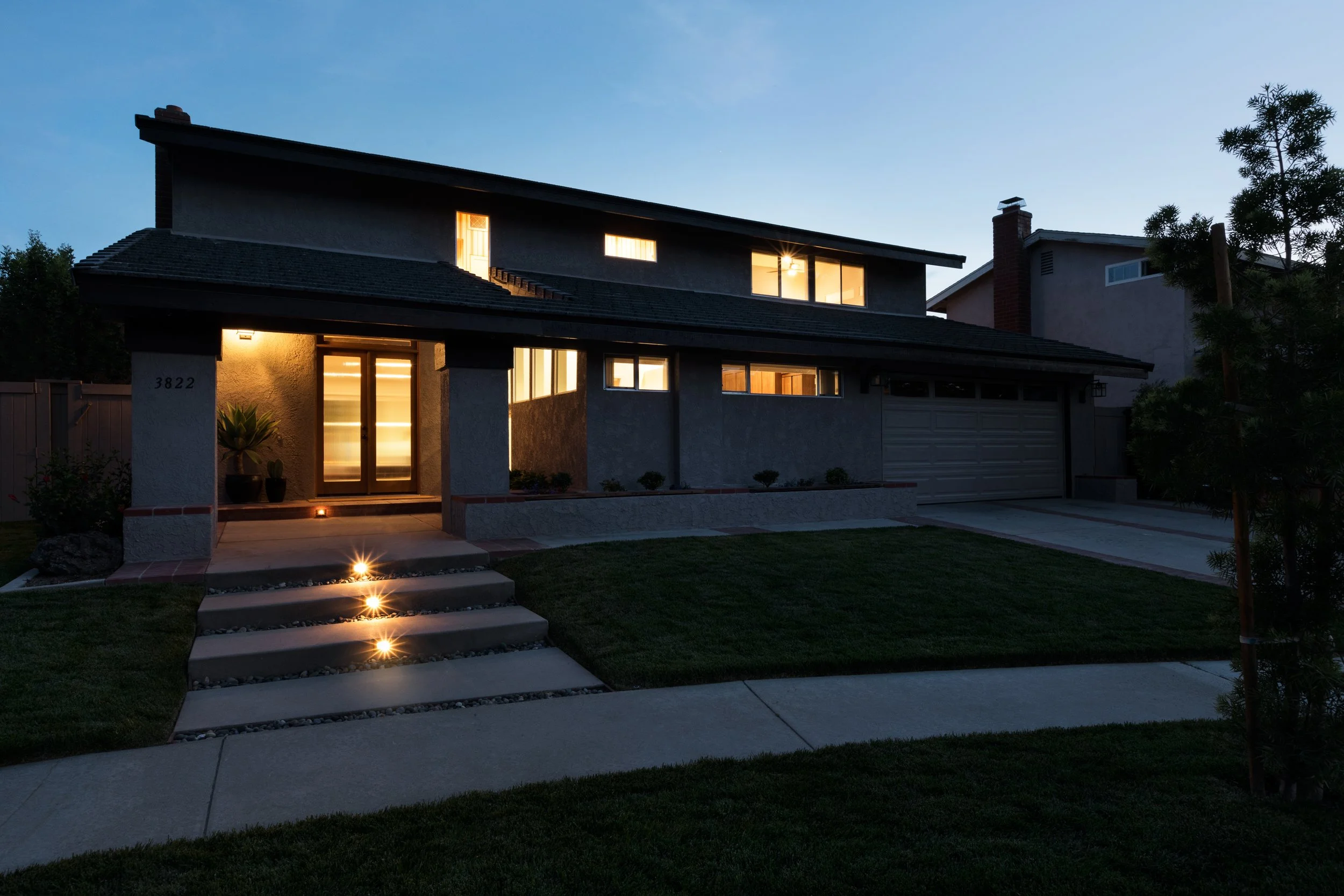
STREET VIEW
The profile of the original house is long and low with the narrow windows tucked under the roofline eaves.
FLOOR PLANS
We have added a bedroom to the first floor and created more light in the kitchen by opening up the exterior wall and bringing in a twelve foot garden window. The second floor shows a vaulted ceiling in the master bedroom and the hallway area on the second floor with four separate areas for linen storage. The master bedroom is larger now with two his and hers walk-in closets and a double vanity.
FRONT ENTRY
At the entry of the house, the new tall windows bring natural light into the front sitting room during the daytime.
The brick hardscape reflects existing finishes in the house and in the backyard.
LIVING ROOM at the ENTRY
The first floor entry is a double height space with new hardwood flooring, hardwood stair with the original iron handrail, restored.
LIVING ROOM
In the living room, the existing fireplace was refurbished and new cabinetry installed at this wall. For maximum storage, the upper shelves float over drawers and lower cabinets.
DINING ROOM
The dining room connects better now to the living room as the existing partition wall was reduced in size. The new hardwood flooring extends into the entry area.
DINING ROOM
Two banks of grey cabinets, with stone tops were designed for this room for keeping dishes and linens. The room has good natural daylight from the large sliding glass doors at the southern back of the house.
DINING ROOM
In this room and the house throughout, the hardwood finishes are similar and the dining room connects to a bonus room at the front of the house.
BONUS ROOM
The vaulted ceiling and tall windows make this a very bright room.
DINING ROOM
The bank of grey cabinets are topped with white quartz and white upper cabinets to allow for the natural light to move through the space from the backyard to the front bonus room.
KITCHEN AT DINING ROOM
The kitchen is larger and brighter now. The exposed wood beams at the ceiling indicate where the previous walls were located before the extensive remodel of the house.
KITCHEN
White upper cabinets are used again in the kitchen with a complimentary white microwave. The return at the counter is useful for more counter space and for staging at holiday gatherings.
KITCHEN
The counter was extended into a custom-built garden window which provides a generous and stunning amount of bright counter space with a panoramic view of the backyard landscape. The pantry and laundry room can be in the next room.
PANTRY
This room has full height cabinets for storage with washer and dryer and a countertop with a utility sink.
POWDER ROOM
The powder room was designed with a square, clay tile with a sylish pattern. A floating hardwood vanity is topped with white quartz, chrome faucets and a white undermount sink. A storage cabinet and shelf are shown over the toilet for storage and style.
HALLWAY
The hallway at the top of the stairs uses a vaulted ceiling for natural light and tall windows. Warm carpet, natural wood and pinstripe wallpaper make this a cozy and bright space.
HALLWAY AT STAIR
This is an exquisiste moment in the project where the collection of finishes and spaces all come together. The soft wood of the handrail and stair stringer extend from the hardwood flooring below up into the vaulted ceiling of the second floor passage. The vertical stripes of the pinstripe wallpaper extend the eye from the iron guardrail into the hallway loft.
At the hallway there are built in cabinets for linens and storage. This image shows a cubby into the guest bathroom.
GUEST BATHROOM
The floating cabinet at the hallway linen cubby compliment the floating vanity inside the guest bathroom. The difference in finishes in consistent in the project with white shaker cabinetry shown at the common spaces in the house with the bathrooms built with hardwood over square, clay tiles. White subway tile is shown in the shower area and a cabinet shelf on the wall for storage and style.
GUEST BATHROOM
The guest bathroom has our signature pinstripe clay tile and hardwood floating vanity with quartz countertop and undermount sink. The issue of storage is resolved with a combination cabinet and shelf over the toilet.
The strip windows at the shower bring natural light into the space.
MASTER BATHROOM
The master bathroom features a floating double vanity with lower and tall side cabinets. There is a center space for a sitting vanity.
MASTER BATHROOM
The shower features a hand shower, a rain shower at the ceiling and a generous shower cubby on the wall.
EXTERIOR ELEVATIONS
The exterior color scheme is light tan with a dark brown trim just as it was in 1971.
CONSTRUCTION
Finishing the beams in the kitchen.
CONSTRUCTION
The beams in the kitchen are being prepared for finishing. The back window will also be installed soon, it is twelve feet long and very heavy.
CONSTRUCTION PHOTO
The house has good natural light now and the vaulted ceiling over the entry is both dramatic and emblematic of mid-century architecture. The hallway, seen here, will have several spaces for linens and storage and will also select a wallpaper pattern for the second floor hallway area to accentuate this common space.
CONSTRUCTION PHOTO
This image shows the new framing on the second floor. This is from the hallway. Some of the burned lumber can still be seen at the stair guardrail and stringer.
CONSTRUCTION PHOTO
Many of the new windows have been framed. The house will get new insulation on the exterior walls and roof.
CONSTRUCTION PHOTO
The interior of the house has been demolished down to the wood framing. This area with the vaulted ceiling is the master bedroom. The new plans show a restored master bedroom with more windows, more closet space and larger master bathroom with a walk-in shower.
STREET VIEW CIRCA 1971
This is an image of the house when it was new in 1971.
We have returned the exterior to its original color scheme of dual tone browns with rough lumber trim. On the inside, we have made some changes which have improved the lower floor layout, provided larger bedrooms with more closet space, and more natural daylighting.
COVER OF THE SECOND SALES MAP
Culverdale was completed in four phases built in a counter-clockwise order. This brochure shows the first two-fourths, or the first half of the planned development.
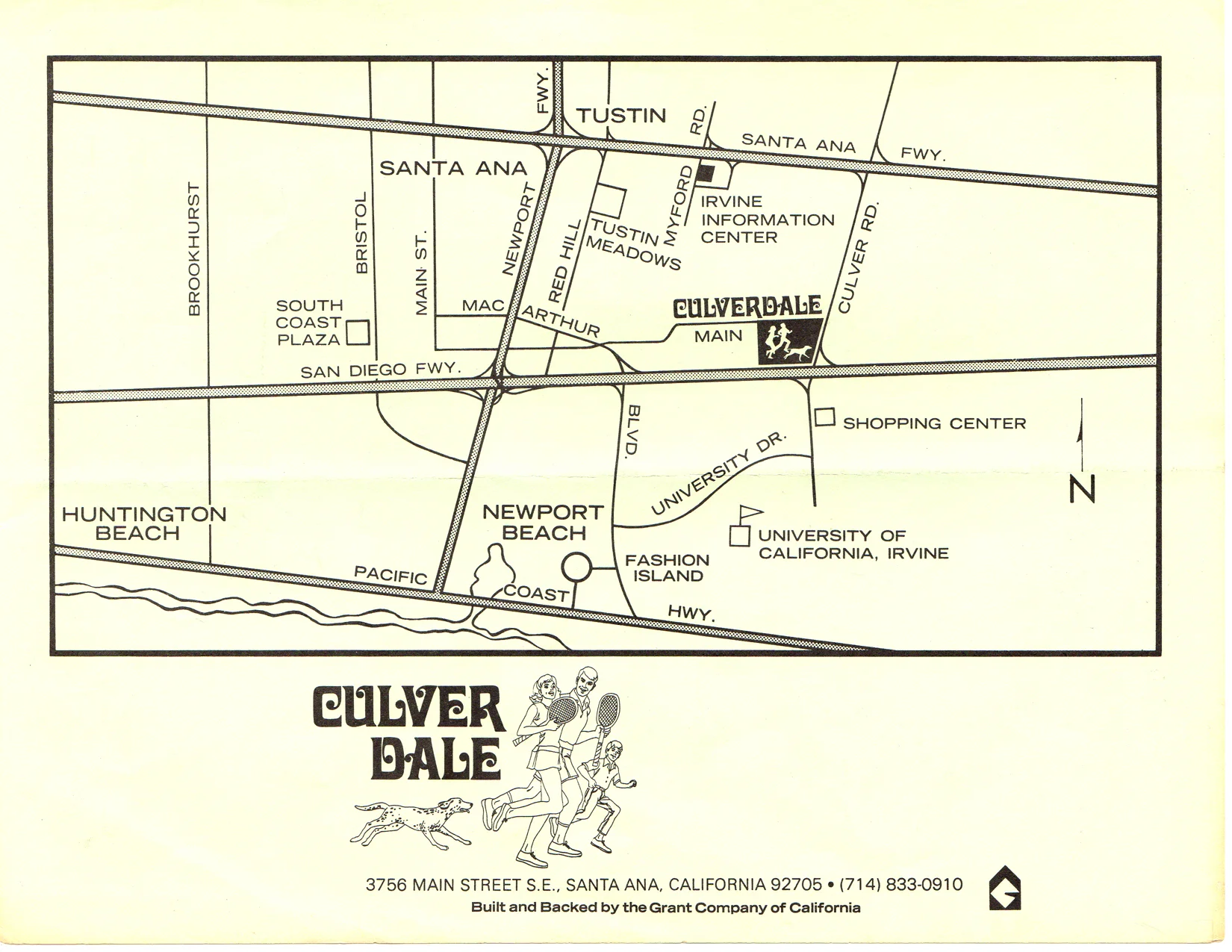
VICINITY MAP CIRCA 1969
This is the vicinity map which shows the location of Culverdale, adjacent Culver Drive. The City of Irvine had not yet been incorporated as a city until 1971.
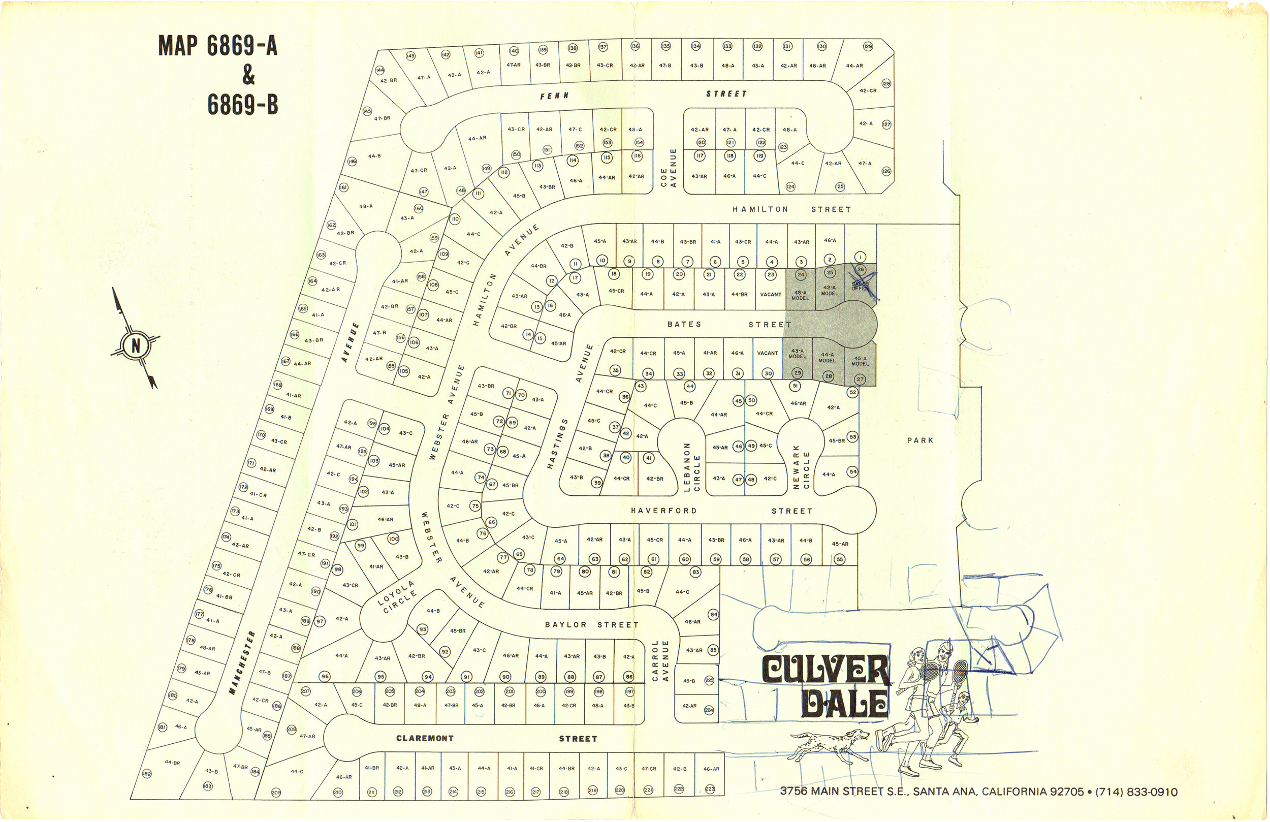
STREET DIAGRAM-SECOND SALES MAP
This map shows the location of the streets and plots for the first half of the development. The lower right area shows a pen sketch of where the next phase of construction was planned. The street indicated by ink is Cosley Street, where the project house is located.
COVER OF THE THIRD SALES MAP
This map was produced around 1970 and shows the third phase of development of Culverdale.
VICINITY MAP CIRCA 1970
This map was produced around 1970 and shows the sales office with a Santa Ana address. The location of Culverdale would be in the city of Irvine, in 1971 after its incoporation.
STREET DIAGRAM-THIRD SALES MAP
This diagram shows the third phase of devlepment in the southeast portion of Culverdale. Our project is located on Cosley street which is highlighted to the south of the park. There is an arrow though the park and an X where the house is located. This was drawn on the brochure by the sales agent from clubouse/rec center as directions to the original plot of land for the owners to review. They walked through the fully built park and to a flat plot of land to consider the purchase of a home that was not yet built.
CULVERDALE PARK-1969
This is another full color layout from the original sales brochure showing the centrally located, Culverdale Park. Many of the streets had yet to be designed or illustrated in this rendering.
CULVERDALE PARK
This is a spread from the original brochure in full color. It shows the amenities at the park in Culverdale.
RECREATION CENTER
This building still exists today with the swimming pool in it original state. The sales office was located next door.
ORIGINAL FLOORPLAN
This is the original floorplan diagram from the original sales brochure. The house that was built was slightly different than advertised and the builder ultimately saved costs on things like windows and plumbing. When we removed the drywall in the master bedroom we found it had been framed for new windows which were never installed-until now.
ORIGINAL RENDERINGS
These are the original renderings for PLAN 44. They show a variations of a two-story house of about nineteen hundred square feet. Our house is the one at the top-The Cambridge. The builder added the six-foot stucco wall around a concrete patio at the front of the house and left large roof timbers of rough sawn lumber exposed. The house had squared openings with a strong horizontal presence at the street view.