MOUNT VERNON
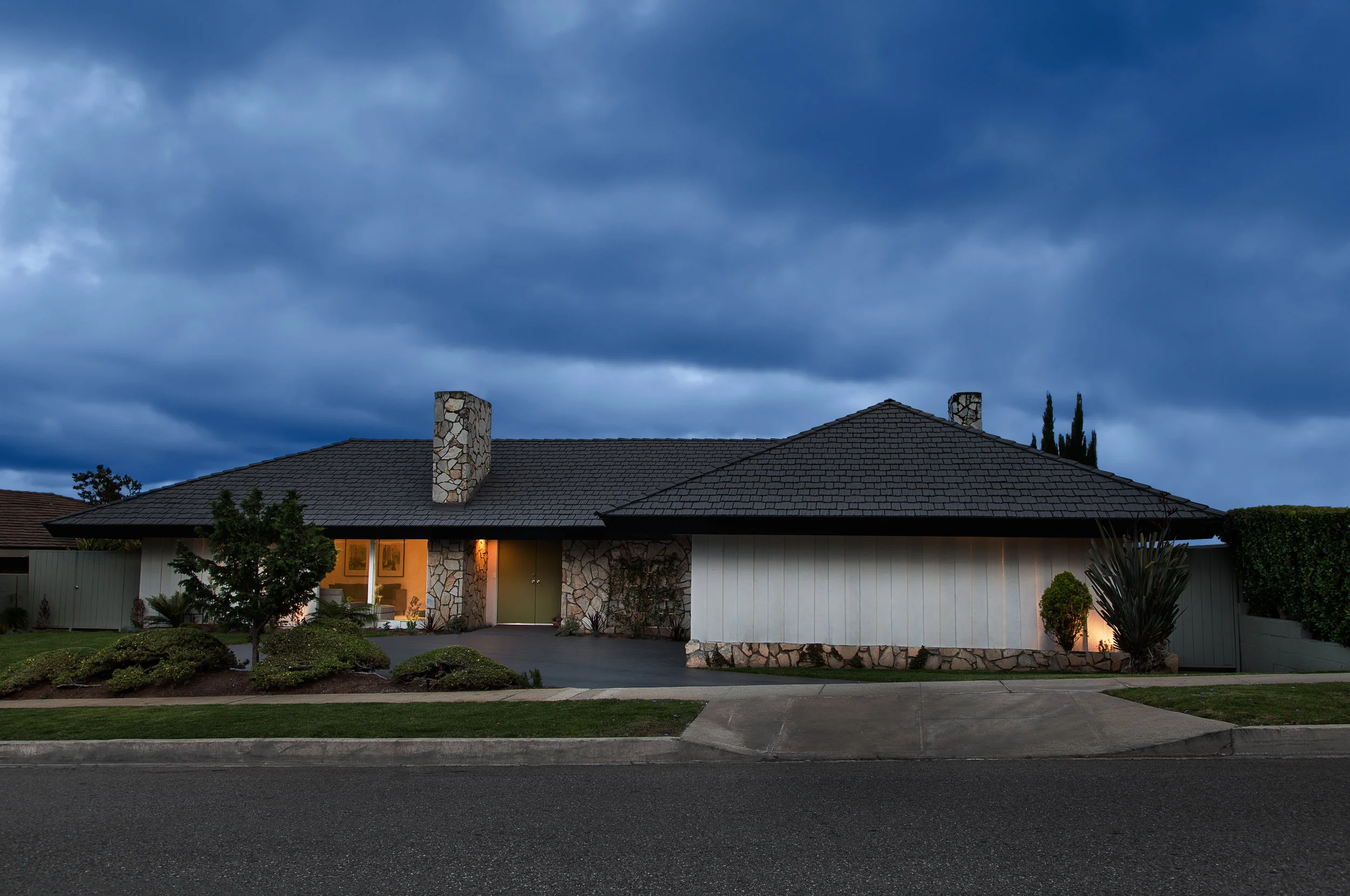
Built in 1958, this example of a classic, mid-century modern home has great bones. The original U-shaped floorplan design allowed for natural lighting to be the best during the mid-day. Our work was to make a few adjustments to create another bedroom, improve the relationship between the interior and the exterior spaces, and create better lighting inside the house during all times of the day.
We respect the design intent of the house and have worked hard to preserve as much as possible on the inside and outside of the structure.
All of the original stonework on the exterior and the interior was preserved and refurbished to its original condition.

STREET VIEW
The house reveals very little from the outside. Inside is abundant natural lighting, 4 bedrooms and bathrooms, 2 living rooms, kitchen and dining with a courtyard and swimming pool.

STREET VIEW
The design strategy for this gem, was a light touch-both inside and out.

SITE PLAN
The house makes a courtyard with a swimming pool in the center at the end. This plan shows the arrangement of the 4 bedrooms and 3 1/2 baths. Our work on the layout was to subdivide a larger bedroom into two smaller rooms of reasonable scale and relocated the bathroom and laundry for convenience.

LIVING ROOM
This room at the entry has a fireplace but was painted a dark color and being situated on the north side of the house, it gets no direct sunlight. We used white interior paint colors, light colored low pile carpet and recessed lighting to brighten up this room.

LIVING ROOM
The fireplace was cleaned and refinished. We used a black color for the trim and left the stone in its original condition.

FAMILY ROOM
The family room has exposed beams and an second fireplace. The room was much darker when the clients purchased the house as it had a large patio cover over the courtyard area, drastically cutting down on the natural light into the space. To brighten this central space, we removed the imposing structure in the courtyard, used light colors on the floor, walls and ceiling and installed recessed lighting in the ceiling to ensure great lighting throughout the changing daylight conditions of the house.

FAMILY ROOM
With both a living room for reading, this family room is centrally located and the best space for activity. As in all of the bathrooms and kitchen, we custom built this entertainment center, lower cabinets with floating shelves and under shelf lighting.

DINING ROOM
This courtyard house had glass walls on the interior side. We opened the wall to the right by removing a small window and adding sliding doors to balance the lighting and allow for a better connection to the outside of the house.

KITCHEN
The flow between the kitchen, dining and family room is much better now. So is the light. We removed large upper cabinets and dated linoleum tile to connect these important spaces. To improve the quality of light, we kept the white with black trim motif and used black quartz counters with white slab-front, frameless cabinets.

MASTER BEDROOM
Has sliding glass doors leading into the courtyard and a private bathroom with walk-in closet.

MASTER BATHROOM
Has double sinks and a floating vanity.

BATHROOMS
All bathrooms were built with white floating vanities, white subway tile, light colored porcelean tile, white paint, chrome fixtures and black trim.

COURTYARD
We removed a large shade structure which had been placed over the pool area which drastically cut out the light into the house. It was replaced with a pair of light sailcloth panels instead. The lighter colors, improved landscaping and renovated hardscape make this central space, truly extraordinary. It was important to open up this space properly to allow for a better and even light flow into the house.

